


In 2024 when I was about to start a new project for a client I decided to go through the React documentation to see if there was anything new going on and I stumbled on a section that recommended using the Next.js framework to build your React project.
Imitation is the best form of flattery and as a frequent user of LinkedIn, I have figured it would be best for me to continue sharpening my skills by cloning the platform.
A journey of a thousand miles begins with a single step. My end goal is to build a fully functional app using the LinkedIn API and to challenge myself as to why LinkedIn developers did what they did as they were building the platform.
Next.js Installation
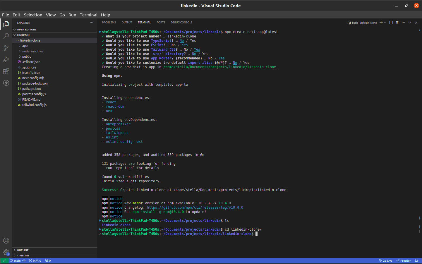
To start a new Next.js project I used the installation instructions found in the documentation.
In the image below you will see my customized preferences (highlighted in blue).
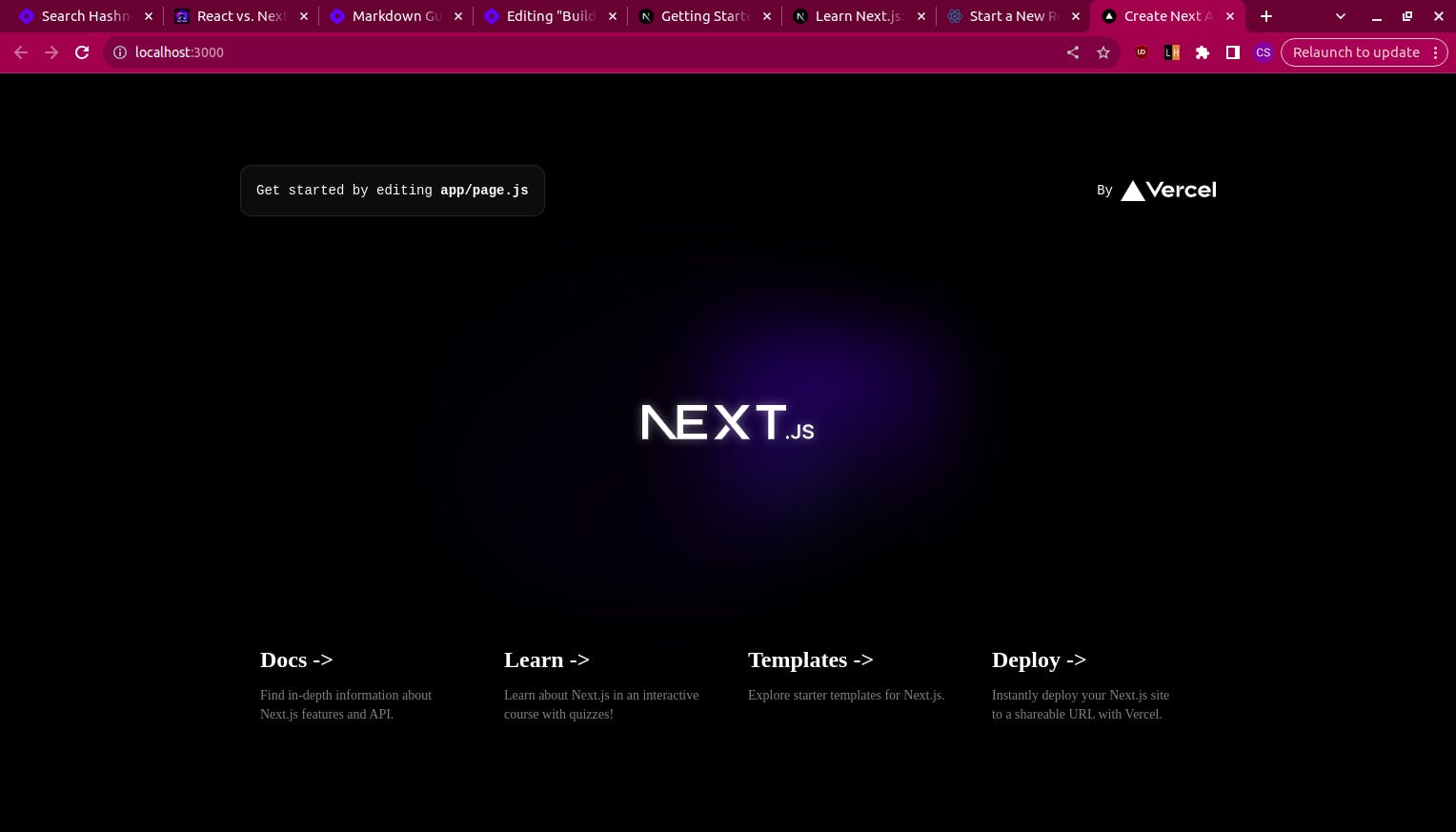
I navigated to my project folder using the cd linkedin-clone command and then npm run dev to confirm my project runs default next.js code as shown below.
Folder Structure
To get a better understanding of the Next.js folder structure have a look at this section of the documentation
Starting the Project
I considered creating a wireframe however since this is a clone I decided to just open my LinkedIn and start coding what I saw.
To start the project I deleted all default code which a huge chunk of can be found in the app/page.js file.
export default function Home() {
  return (
    <div>

    </div>
  );
}
I then edited the favicon, website title, and description as well as default importations that were unnecessary at this point in the app/layout.js file.
I noticed the title is dynamic as you navigate across different pages and that is something we will explore how to accomplish later on.
import "./globals.css";

export const metadata = {
  title: "Linkedin",
  description: "linkedin.com",
};

export default function RootLayout({ children }) {
  return (
    <html lang="en">
      <body>
        <main className="relative overflow-hidden">
          {children}
        </main>
      </body>
    </html>
  );
}
Installing Flowbite
I will be using Flowbite since it has good interactive UI components built using Tailwind CSS.
To set up Flowbite in your project use this section of the documentation.
Building the Navigation Bar
One of the benefits of React is creating reusable components.
A component is an independent piece of code that can be reused. It allows developers to save time in rewriting code that is implemented in more than one area of the application.
The navigation bar is consistent across the different pages. So it would be ideal to create a navigation component that will be reused in our application.
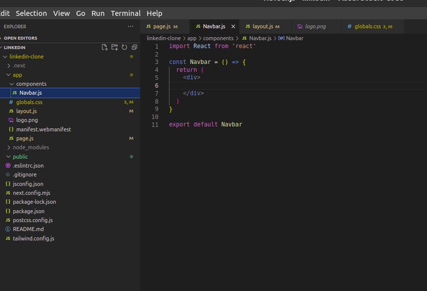
Inside the app/ folder, I will create a components/ folder that will have the Navbar.js file.
The fonts mainly used on Linkedin are documented here.
To add custom fonts in TailwindCSS we follow the following steps:-
We create a new folder named fonts and extract the downloaded file above there.
In the
global.cssfile, we will add the font family files as shown below.@font-face { font-family: "SourceCodePro-Regular"; src: url("./fonts/SourceCodePro/SourceCodePro-Regular.ttf"); } @font-face { font-family: "SourceCodePro-Light"; src: url("./fonts/SourceCodePro/SourceCodePro-Light.ttf"); } @font-face { font-family: "SourceCodePro-Semibold"; src: url("./fonts/SourceCodePro/SourceCodePro-Semibold.ttf"); } @font-face { font-family: "SourceSansPro-Regular"; src: url("./fonts/SourceSansPro/SourceSansPro-Regular.ttf"); } @font-face { font-family: "SourceSansPro-Semibold"; src: url("./fonts/SourceSansPro/SourceSansPro-Semibold.ttf"); } @font-face { font-family: "SourceSansPro-Light"; src: url("./fonts/SourceSansPro/SourceSansPro-Light.ttf"); } @font-face { font-family: "SourceSerifPro-Light"; src: url("./fonts/SourceSerifPro/SourceSerifPro-Regular.ttf"); } @font-face { font-family: "SourceSerifPro-Semibold"; src: url("./fonts/SourceSerifPro/SourceSerifPro-Semibold.ttf"); } @font-face { font-family: "arial-regular"; src: url("./fonts/arial-regular/ArialRegular/ArialRegular.ttf"); }In the
tailwind.config.jsfile, we will define the font family./** @type {import('tailwindcss').Config} */ module.exports = { content: [ "./pages/**/*.{js,ts,jsx,tsx,mdx}", "./components/**/*.{js,ts,jsx,tsx,mdx}", "./app/**/*.{js,ts,jsx,tsx,mdx}", "./node_modules/flowbite/**/*.js", ], theme: { extend: { fontFamily: { SourceCodeProRegular : "SourceCodePro-Regular", SourceCodeProLight: "SourceCodePro-Light", SourceCodeProSemibold: "SourceCodePro-Semibold", SourceSansProRegular : "SourceSansPro-Regular", SourceSansProSemibold : "SourceSansPro-Semibold", SourceSansProLight : "SourceSansPro-Light", SourceSerifProLight: "SourceSerifPro-Light", SourceSerifProSemibold: "SourceSerifPro-Semibold", ArialRegular : "arial-regular", }, }, }, plugins: [ require('flowbite/plugin') ], };
We will also add the icons to the navbar.
To download free icons I used iconfinder.
Some of the icons were hard to find a replica so I used what I could find online.
Here's the Navbar code so far, we will work on the responsiveness later on.
import React from 'react'

const Navbar = () => {
  return (
    <div className='bg-white'>
        <div className='md:mx-8 py-3 flex flex-row w-full'>
            <div className='grid grid-cols-2 w-[20%] ml-40'>
                <img src="/logo.png" className='h-10 rounded-md' alt="linkedin logo"/>
                <div class="absolute ml-12">
                    <div class="absolute inset-y-0 start-0 flex items-center ps-3 pointer-events-none">
                        <svg class="w-4 h-4 text-gray-500 dark:text-gray-400" aria-hidden="true" xmlns="http://www.w3.org/2000/svg" fill="none" viewBox="0 0 20 20">
                            <path stroke="currentColor" stroke-linecap="round" stroke-linejoin="round" stroke-width="2" d="m19 19-4-4m0-7A7 7 0 1 1 1 8a7 7 0 0 1 14 0Z"/>
                        </svg>
                    </div>
                    <input type="search" id="search" class="block w-full p-2.5 ps-10 text-sm text-gray-900 border border-gray-300 rounded-lg bg-blue-50 focus:ring-blue-500 focus:border-blue-500 dark:bg-gray-700 dark:border-gray-600 dark:placeholder-gray-400 dark:text-white dark:focus:ring-blue-500 dark:focus:border-blue-500" placeholder="Search"/>
                </div>
            </div>
            <div className='mx-28 flex flex-row'>
                <div className='grid grid-cols-7 px-22'>
                    <div className='flex flex-col items-center'>
                        <img src="/icons/home.png" className='h-6 w-6' alt="home icon" />
                        <sm className='font-SourceSansProLight text-sm'>Home</sm>
                    </div>
                    <div className='flex flex-col items-center'>
                        <img src="/icons/network.png" className='h-6 w-6' alt="network icon" />
                        <sm className="font-SourceSansProLight text-sm">My Network</sm>
                    </div>
                    <div className='flex flex-col items-center'>
                        <img src="/icons/jobs.png" className='h-6 w-6' alt="jobs icon" />
                        <sm className="font-SourceSansProLight text-sm">Jobs</sm>
                    </div>
                    <div className='flex flex-col items-center'>
                        <img src="/icons/message.png" className='h-6 w-6' alt="messaging icon" />
                        <sm className="font-SourceSansProLight text-sm">Messaging</sm>
                    </div>
                    <div className='flex flex-col items-center'>
                        <img src="/icons/notifications.png" className='h-6 w-6' alt="notification icon" />
                        <sm className="font-SourceSansProLight text-sm">Notifications</sm>
                    </div>
                    <div className='flex flex-col items-center'>
                        <img src="https://flowbite.s3.amazonaws.com/blocks/marketing-ui/avatars/bonnie-green.png" className='w-6 h-6 rounded-full' alt="profile" />
                        <div className='flex flex-row'>
                            <sm className="font-SourceSansProLight text-sm">Me </sm>
                            <img src="/icons/arrow.png" className='h-4 w-4 mt-1' alt="arrow"/>
                        </div>
                    </div>
                    <div className='flex flex-col items-center'>
                        <img src="/icons/grid.png" className='w-6 h-6' alt="profile" />
                        <div className='flex flex-row'>
                            <sm className="font-SourceSansProLight text-sm">For Business</sm>
                            <img src="/icons/arrow.png" className='h-4 w-4 mt-1' alt="arrow"/>
                        </div>
                    </div>
                </div>
                <div className='w-28 mx-4 flex items-center justify-center'>
                    <sm className="font-SourceSansProRegular text-sm underline text-wrap text-yellow-700">Network Smarter, Try Premium Free</sm>
                </div>
            </div>
        </div>

    </div>
  )
}

export default Navbar
This is what my navbar looks like so far.

The LinkedIn home page is divided horizontally into three columns. I created a folder known as homepage that has three files i.e Feed.js, Profile.js and Info.js .
In my page.js file which will display the homepage, I divided it into 3 columns as shown in the code below.
import Feed from './homepage/Feed';
import Info from './homepage/Info';
import Profile from './homepage/Profile'

export default function Home() {
  return (
    <div className='bg-gray-100'>
      <div className="flex flex-row pt-6 justify-center mx-16">
        <div className='w-[18%] mr-4'>
        <Profile />
        </div>
        <div className='w-[40%] mr-4'>
          <Feed/>
        </div>
        <div className='w-[22%]'>
          <Info/>
        </div>
      </div>

    </div>

  );
}
In the profile.js component, I added the following code.
import React from 'react'

const Profile = () => {
  return (
    <div>
        {/* Profile */}
        <div className='rounded-lg border-gray-200 bg-white border-2 pb-2'>
            <div className='flex flex-col relative pb- '>
                <img src="profile/bg-profile.jpg" alt="banner image" className='w-full h-12 object-cover rounded-t-md' />
                <img src="https://flowbite.s3.amazonaws.com/blocks/marketing-ui/avatars/bonnie-green.png" alt="profile" className='relative top-[100%] z-20 left-1/2 transform -translate-x-1/2 -translate-y-1/2 w-16 h-16 rounded-full border-white border-2' />
                <h4 className='font-SourceSansProSemibold text-center text-lg font-bold'>Stella Waithera</h4>
                <p className='text-center font-ArialRegular text-gray-500 text-[13px] mx-4'>Founder of AfricanSTEMGirl Org||Creator and Lead Organizer AfricaSTEMsummit||Founder of The Transition Series Kenya||Fullstack developer(ReactJS,Django)||Digital skills Instructor|| Technical Writer(SheCodeAfrica)</p>
                <hr class="h-px my-4 bg-gray-200 border-0 dark:bg-gray-700"></hr>
                <div className='flex flex-row w-full mx-4 mb-1'>
                    <sm className='flex-grow text-left text-sm font-SourceSansProSemibold text-gray-600'>Profile Viewers</sm>
                    <sm className='text-right text-sm mr-10 text-blue-500 font-bold'>224</sm>
                </div>
                <div className='flex flex-row w-full mx-4 mb-1'>
                    <sm className='flex-grow text-left text-sm font-SourceSansProSemibold text-gray-600'>Post Impressions</sm>
                    <sm className='text-right text-sm mr-10 text-blue-500 font-bold'>1,757</sm>
                </div>
                <hr class="h-px my-4 bg-gray-200 border-0 dark:bg-gray-700"></hr>
                <p className='text-left font-SourceSansProLight text-sm mx-4 text-gray-600 font-bold'>Grow professionally with Premium </p>
                <div className='mx-4 flex flex-row items-center'>
                    <img src="https://img.freepik.com/free-photo/vivid-blurred-colorful-wallpaper-background_58702-5935.jpg" alt="square" className='w-3 h-3'/>
                    <p className='font-SourceSansProSemibold text-center text-sm font-bold ml-2'>Try Premium for KES0</p>
                </div>
                <hr class="h-px my-4 bg-gray-200 border-0 dark:bg-gray-700"></hr>
                <div className='mx-3 flex flex-row items-center'>
                    <img src="/icons/bookmark.png" alt="square" className='w-4 h-4'/>
                    <p className='font-SourceSansProSemibold text-center text-sm font-bold ml-2'>My items</p>
                </div>
            </div>
        </div>
        {/* My pages */}
        <div className='rounded-lg border-gray-200 bg-white border-2 pb-2 mt-2 px-3 py-2'>
        <h4 className='font-SourceSansProSemibold text-left text-lg font-bold'>My Pages (5)</h4>
        <div className='flex flex-row'>
            <img src="lorem.jpg" alt="page logo" className='w-10 h-10 object-cover' />
            <div className='flex flex-col'>
                <h3 className='font-SourceSansProSemibold text-left ml-4 text-md font-bold'>Lorem Ipsum</h3>
                <div className='flex flex-row w-full mx-4 mb-1'>
                    <sm className='flex-grow text-left text-xs font-ArialRegular font-bold text-gray-600'>Page notifications</sm>
                    <sm className='text-right text-sm mr-2 text-blue-500 font-bold'>7</sm>
                </div>
            </div>
        </div>
        <hr class="h-px my-4 ml-12 bg-gray-200 border-0 dark:bg-gray-700"></hr>
        <div className='flex flex-row'>
            <img src="lorem.jpg" alt="page logo" className='w-10 h-10 object-cover' />
            <div className='flex flex-col'>
                <h3 className='font-SourceSansProSemibold text-left ml-4 text-md font-bold'>Lorem Ipsum</h3>
                <div className='flex flex-row w-full mx-4 mb-1'>
                    <sm className='flex-grow text-left text-xs font-ArialRegular font-bold text-gray-600'>Page notifications</sm>
                    <sm className='text-right text-sm mr-2 text-blue-500 font-bold'>7</sm>
                </div>
            </div>
        </div>
        <hr class="h-px my-4 w-full bg-gray-200 border-0 dark:bg-gray-700"></hr>
        <div className='flex justify-center'>
        <sm className='text-sm font-ArialRegular text-gray-600 font-bold'>See all my Pages</sm>
        </div>

        </div>
        {/* Recent Events */}

        <div className='rounded-lg border-gray-200 bg-white border-2 pb-2 mt-2 px-3 py-2'>
        <p className='font-SourceSansProLight text-left text-sm font-semibold my-2'>Recent</p>
        <div className='flex flex-row align-middle items-center mb-1'>
            <img src="event.png" className='w-4 h-4' alt="event" />
            <sm className='ml-2 flex-grow text-left text-sm font-SourceSansProSemibold text-gray-600'>How to recruit a developer</sm>
        </div>
        <div className='flex flex-row align-middle items-center mb-1'>
            <img src="community.png" className='w-4 h-4' alt="event" />
            <sm className='ml-2 flex-grow text-left text-sm font-SourceSansProSemibold text-gray-600'>Python Developer Community</sm>
        </div>
        <div className='flex flex-row align-middle items-center mb-1'>
            <img src="event.png" className='w-4 h-4' alt="event" />
            <sm className='ml-2 flex-grow text-left text-sm font-SourceSansProSemibold text-gray-600'>Full-Stack Machine Learning</sm>
        </div>
        <p className='font-SourceSansProSemibold text-left text-sm font-bold text-blue-500 my-4'>Groups</p>
        <div className='flex flex-row align-middle items-center mb-1'>
            <img src="community.png" className='w-4 h-4' alt="event" />
            <sm className='ml-2 flex-grow text-left text-sm font-SourceSansProSemibold text-gray-600'>Python Developer Community</sm>
        </div>
        <div className='flex flex-row align-middle items-center mb-1'>
            <img src="community.png" className='w-4 h-4' alt="event" />
            <sm className='ml-2 flex-grow text-left text-sm font-SourceSansProSemibold text-gray-600'>Africa Professionals Group</sm>
        </div>
        <div className='flex flex-row align-middle items-center mb-1'>
            <img src="community.png" className='w-4 h-4' alt="event" />
            <sm className='ml-2 flex-grow text-left text-sm font-SourceSansProSemibold text-gray-600'>Hernovation</sm>
        </div>
        <div className='flex flex-row mb-1'>
            <sm className='ml-6 text-left text-sm font-SourceSansProSemibold text-gray-600'>Show More</sm>
            <img src="arrowdown.png" className='w-6 h-6' alt="event" />
        </div>
        <div className='flex flex-row align-middle items-center mb-1 mt-4'>
            <sm className='flex-grow text-left text-sm font-SourceSansProSemibold text-blue-500'>Events</sm>
            <img src="plus.png" className='w-6 h-6' alt="event" />
        </div>
        <sm className='flex-grow text-left text-sm font-SourceSansProSemibold text-blue-500 mb-4'>Followed Hashtags</sm>
        <div className='flex flex-row align-middle items-center mb-1'>
            <img src="hashtag.png" className='w-4 h-4' alt="event" />
            <sm className='ml-2 flex-grow text-left text-sm font-SourceSansProSemibold text-gray-600'>Python Developer Community</sm>
        </div>
        <div className='flex flex-row align-middle items-center mb-1'>
            <img src="hashtag.png" className='w-4 h-4' alt="event" />
            <sm className='ml-2 flex-grow text-left text-sm font-SourceSansProSemibold text-gray-600'>Africa Professionals Group</sm>
        </div>
        <div className='flex flex-row align-middle items-center mb-1'>
            <img src="hashtag.png" className='w-4 h-4' alt="event" />
            <sm className='ml-2 flex-grow text-left text-sm font-SourceSansProSemibold text-gray-600'>Hernovation</sm>
        </div>
        <div className='flex flex-row mb-1'>
            <sm className='ml-6 text-left text-sm font-SourceSansProSemibold text-gray-600'>Show More</sm>
            <img src="arrowdown.png" className='w-6 h-6' alt="event" />
        </div>


        </div>
    </div>
  )
}

export default Profile
In the Feed.js file, I added the following code.
import React from 'react'

const Feed = () => {
  return (
    <div>
      {/* search */}
      <div className='rounded-lg border-gray-200 bg-white border-2 pb-2'>
        <div className='flex flex-row p-4 items-center w-full'>
          <div className='w-[10%]'>
          <img src="https://flowbite.s3.amazonaws.com/blocks/marketing-ui/avatars/bonnie-green.png" alt="profile" className='w-12 h-12 rounded-full' />
          </div>
          <div className='w-[90%] '>
          <form class="mx-auto">
            <input type="search" id="default-search" class="ml-2 block w-full p-3 text-sm text-gray-900 border border-gray-300 rounded-full" placeholder="Start a post" />
          </form>
          </div>
        </div>
        <div className='px-10 mb-2'>
          <div className='grid grid-cols-3 gap-2'>
            <div className='flex flex-row items-center'>
              <img src="media.png" alt="media" className='w-5 h-5' />
              <sm className='ml-2 text-left text-md font-SourceSansProSemibold text-gray-600'>Media</sm>
            </div>
            <div className='flex flex-row items-center'>
              <img src="calendar.png" alt="media" className='w-4 h-5' />
              <sm className='ml-2 text-left text-md font-SourceSansProSemibold text-gray-600'>Event</sm>
            </div>
            <div className='flex flex-row items-center'>
              <img src="article.png" alt="media" className='w-5 h-5' />
              <sm className='ml-2 text-left text-md font-SourceSansProSemibold text-gray-600'>Write article</sm>
            </div>
          </div>
        </div>
      </div>
      {/* horizontal */}
      <div className='flex flex-row items-center'>
        <hr class="h-px my-4 w-[82%] bg-gray-200 border-0 dark:bg-gray-700"></hr>
        <div className='flex flex-row'>
          <p className='ml-1 text-center font-SourceSansProLight text-sm flex-grow'>Sort by:</p>
          <div className='flex flex-row items-center'>
            <sm className='ml-1 text-left text-sm font-SourceSansProSemibold'>Top</sm>
            <img src="down.png" className='w-4 h-4 ml-1' alt="event" />
          </div>
        </div>
      </div>
      {/* feed */}
      <div className='rounded-lg border-gray-200 bg-white border-2 pb-2'>
        <div className='flex flex-row p-4 items-center'>
          <img src="https://flowbite.s3.amazonaws.com/blocks/marketing-ui/avatars/bonnie-green.png" className='w-14 h-14 rounded-full' alt="profile" />
          <div className='flex flex-col ml-2 '>
            <div className='flex flex-row items-center'>
              <h4 className='font-SourceSansProSemibold text-center text-md'>Stella Waithera</h4>
              <img src="dot.png" alt="fullstop" className='w-4 h-4 mt-1'/>
              <p className='text-center font-SourceSansProLight text-sm text-gray-900'>1st</p>
            </div>
            <div className=''>
              <p className='font-SourceSansProLight text-sm text-gray-900'>Founder of AfricanSTEMGirl</p>
            </div>
            <div className='flex flex-row items-center'>
              <p className='text-center font-SourceSansProLight text-sm text-gray-900'>57 min</p>
              <img src="dot.png" alt="fullstop" className='w-4 h-4'/>
              <img src="globe.png" alt="fullstop" className='w-4 h-4'/>
            </div>
          </div>
          <div className='flex flex-row items-center ml-60 mb-10'>
            <img src="more.png" alt="more" className='w-4 h-4 mr-4'/>
            <img src="cancel.png" alt="cancel" className='w-4 h-4'/>
          </div>
        </div>
        <div className='flex flex-col space-y-2 w-full'>
          <div className='flex flex-col mx-4'>
            <p className='font-ArialRegular text-base text-gray-800'>
              What a night! Join me in applauding the incredible talent, innovation, glamour, and swag experienced yesterday at the Black Tech Achievements Awards! Still in Awe!!!
            </p>
            <br></br>
            <a href="" className='font-ArialRegular text-base text-blue-700 '>
              Black Tech Achievement Awards
            </a>
            <br></br>
            <div className='flex flex-flow'>
              <a href="#" className='font-ArialRegular text-base text-blue-700 mr-2'>
                #BlackTechAwards
              </a>
              <a href="#" className='font-ArialRegular text-base text-blue-700 mr-2'>
                #TechAwards
              </a>
              <a href="#" className='font-ArialRegular text-base text-blue-700 '>
                #Awards
              </a>
            </div>
          </div>
          <img src="https://img.freepik.com/free-vector/music-event-poster-template-with-abstract-shapes_1361-1316.jpg" alt="feed image" className='w-full p-0 object-cover'/>
          <div className='flex flex-col mx-4'>
            <div className='flex flex-row w-full mb-1 items-center'>
              <img src='feedicons/likesmall.png' className='w-4 h-4' alt="like icon"></img>
              <sm className='flex-grow text-left text-sm font-SourceSansProSemibold text-gray-600 ml-1'>4</sm>
              <sm className='text-left text-sm font-SourceSansProSemibold text-gray-600'>4 reposts</sm>
            </div>
          </div>
          <hr class="h-px my-4 mx-4 bg-gray-200 border-0 dark:bg-gray-700"></hr>
          <div className='flex flex-row mx-4'>
            <div className='flex flex-row items-center'>
              <img src="https://flowbite.s3.amazonaws.com/blocks/marketing-ui/avatars/bonnie-green.png" className='w-6 h-6 rounded-full' alt="profile" />
              <img src="/icons/arrow.png" className='h-4 w-4 mt-1' alt="arrow"/>
            </div>
            <div className='flex flex-row mx-6'>
              <div className='flex flex-row mx-4 items-center'>
                <img src='feedicons/likebig.png' className='w-6 h-6 mr-1' alt="like icon"></img>
                <sm className='flex-grow text-left text-md font-SourceSansProSemibold text-gray-600'>Like</sm>
              </div>
              <div className='flex flex-row mx-4 items-center'>
                <img src='feedicons/comment.png' className='w-4 h-4 mr-1' alt="comment icon"></img>
                <sm className='flex-grow text-left text-md font-SourceSansProSemibold text-gray-600'>Comment</sm>
              </div>
              <div className='flex flex-row mx-4 items-center'>
                <img src='feedicons/repost.png' className='w-6 h-6 mr-1' alt="retweet icon"></img>
                <sm className='flex-grow text-left text-md font-SourceSansProSemibold text-gray-600'>Repost</sm>
              </div>
              <div className='flex flex-row mx-4 items-center'>
                <img src='feedicons/send.png' className='w-4 h-4 mr-1' alt="like icon"></img>
                <sm className='flex-grow text-left text-md font-SourceSansProSemibold text-gray-600'>Send</sm>
              </div>
            </div>

          </div>

        </div>

      </div>

    </div>
  )
}

export default Feed
In the Info.js file, I added the following code.
import React from 'react'

const Info = () => {
  return (
    <div>
      <div className='rounded-lg border-gray-200 bg-white border-2 pb-2'>
        <div className='flex flex-row items-center mx-4 my-3'>
          <h4 className='font-SourceSansProSemibold text-left text-lg font-bold flex-grow'>Add to your feed</h4>
          <img src="feedicons/info.png" alt="info"  className='w-3 h-3' />
        </div>
        <div className='flex flex-row items-start px-4 mb-3'>
          <img src="https://flowbite.s3.amazonaws.com/blocks/marketing-ui/avatars/bonnie-green.png" alt="profile" className='w-12 h-12 rounded-full' />
          <div className='flex flex-col ml-1'>
            <h4 className='font-SourceSansProSemibold text-md'>Stella Waithera</h4>
            <p className='font-SourceSansProLight text-sm'>Founder of AfricanSTEMGirl Org</p>
            <div className='flex mb-3'>
              <button type="button" className="flex flex-center items-center px-3 mt-1 text-lg font-SourceSansProSemibold text-gray-900  rounded-full border border-gray-500 focus:z-10">
                <img src="feedicons/plus.png" alt="plus" className='w-5 h-5'/>
                Follow
              </button>
            </div>
          </div>
        </div>
        <div className='flex flex-row items-start px-4'>
          <img src="https://flowbite.s3.amazonaws.com/blocks/marketing-ui/avatars/bonnie-green.png" alt="profile" className='w-12 h-12 rounded-full' />
          <div className='flex flex-col ml-1'>
            <h4 className='font-SourceSansProSemibold text-md'>Stella Waithera</h4>
            <p className='font-SourceSansProLight text-sm'>Founder of AfricanSTEMGirl Org</p>
            <div className='flex mb-3'>
              <button type="button" className="flex flex-center items-center px-3 mt-1 text-lg font-SourceSansProSemibold text-gray-900  rounded-full border border-gray-500 focus:z-10">
                <img src="feedicons/plus.png" alt="plus" className='w-5 h-5'/>
                Follow
              </button>
            </div>
          </div>
        </div>

        <div className='flex flex-row items-start px-4 mb-3'>
          <img src="https://flowbite.s3.amazonaws.com/blocks/marketing-ui/avatars/bonnie-green.png" alt="profile" className='w-12 h-12 rounded-full' />
          <div className='flex flex-col ml-1'>
            <h4 className='font-SourceSansProSemibold text-md'>Stella Waithera</h4>
            <p className='font-SourceSansProLight text-sm'>Founder of AfricanSTEMGirl Org</p>
            <div className='flex mb-3'>
              <button type="button" className="flex flex-center items-center px-3 mt-1 text-lg font-SourceSansProSemibold text-gray-900  rounded-full border border-gray-500 focus:z-10">
                <img src="feedicons/plus.png" alt="plus" className='w-5 h-5'/>
                Follow
              </button>
            </div>
          </div>
        </div>
        <sm className='flex items-center text-left mx-4 text-[15px] font-ArialRegular font-bold text-gray-600 mt-2'>View all recommendations
        <img src="feedicons/arrowleft.png" className='ml-1 w-5 h-5' alt="arrow" />
        </sm>
      </div>

      <div className='flex flex-wrap flex-row mx-4 justify-center space-x-4 space-y-2'>
        <p className='font-SourceSansProLight text-sm mt-2'>About</p>
        <p className='font-SourceSansProLight text-sm'>Accessibility</p>
        <p className='font-SourceSansProLight text-sm'>Help Center</p>
        <p className='font-SourceSansProLight text-sm flex items-center flex-row'>Privacy & Terms <img src="down.png" className='w-3 h-3 ml-1' alt="event" /></p>
        <p className='font-SourceSansProLight text-sm'>Ad Choices</p>
        <p className='font-SourceSansProLight text-sm'>Advertising</p>
        <p className='font-SourceSansProLight text-sm flex items-center flex-row'>Business Services <img src="down.png" className='w-3 h-3 ml-1' alt="event" /></p>
        <p className='font-SourceSansProLight text-sm'>Get the linkedin app</p>
        <p className='font-SourceSansProLight text-sm'>More</p>
      </div>

      <div className='flex flex-row my-3 items-center mx-4 justify-center'>
        <img src="feedicons/linkedinlogo.png" alt="linkedin logo" className='w-16 h-10' />
        <p className='font-SourceSansProLight text-sm font-semibold ml-1'>LinkedIn Corporation © 2024</p>
      </div>
    </div>
  )
}

export default Info
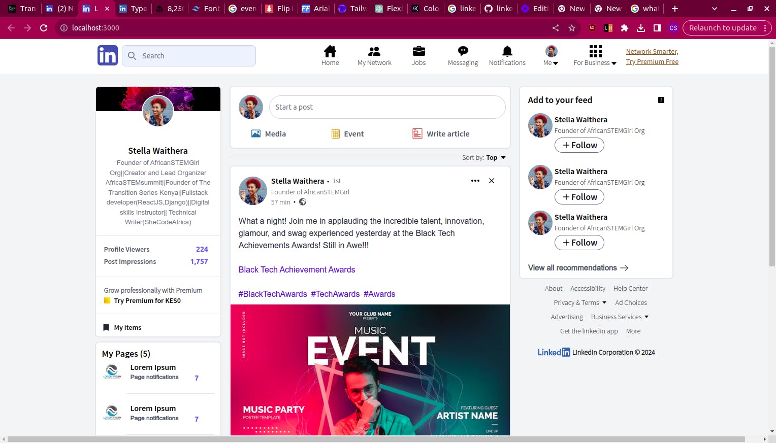
At the moment the focus was achieving the layout of the homepage.
Here's what the final output currently looks like.
The full code can be found in this repository
The deployed project can be found at this link.
Let me know areas I should consider improving on.
See you in the next read as we continue to build this project.